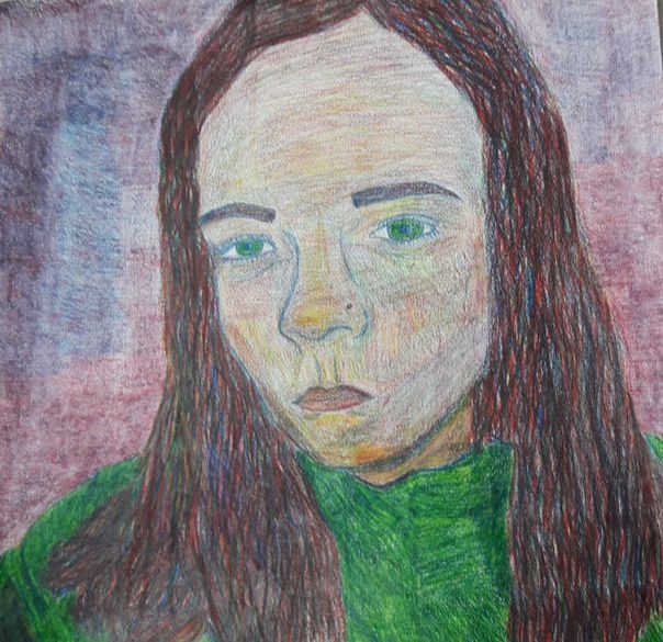
    1. The craftsmanship of my portrait is in between neat and a little messy.
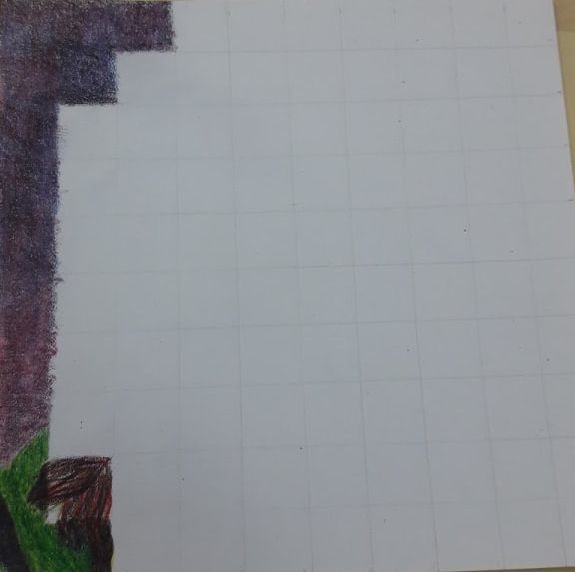
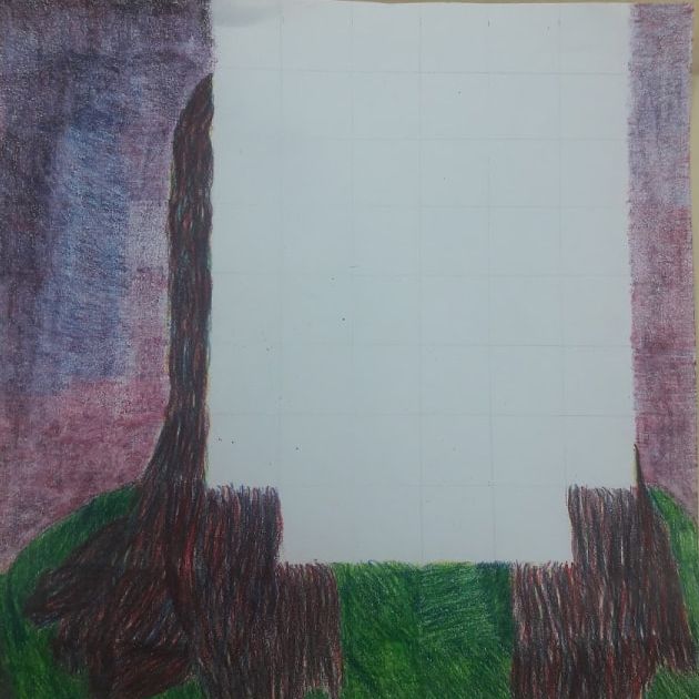
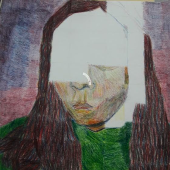
2. The difficulties i had with this project was the skin color and the hair. I improvised and made it more cartoonish than realistic. 3. In some of the background and they eyes i didn't follow in each square especially the eyes because they were the hardest. It is important to draw in each grid separately to make it look neat and not messy. 4. I created value change in my colored pencils by mixing certain colors together and make some colors darker in darker areas and some colors lighter in lighter areas. 5. I got all these colors from three pencils by overlapping and mixing the colors together. 6. I could improve my portrait by going slower and more detailed in the skin tone 7. In my opinion i was uneasy about the project and how i was going to successfully make different colors from the three pencils i was using. The beneficial part of the project was to blend, mix, and to color in each square individually. 8. I feel that Helen julians piece was an amazing example of shading and blending and getting value in the hair and face.
0 Comments
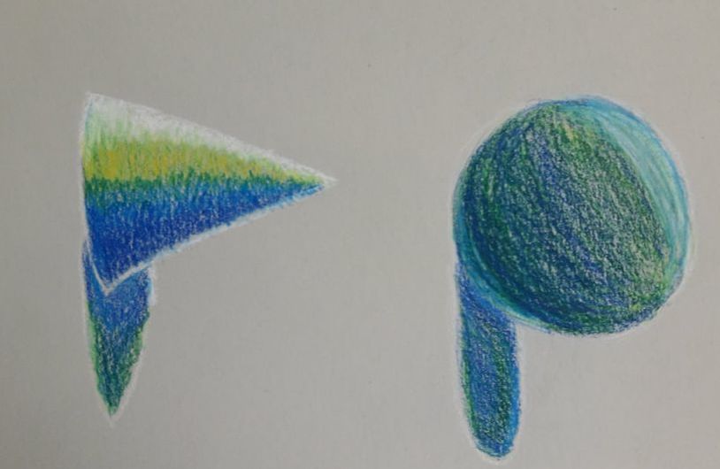 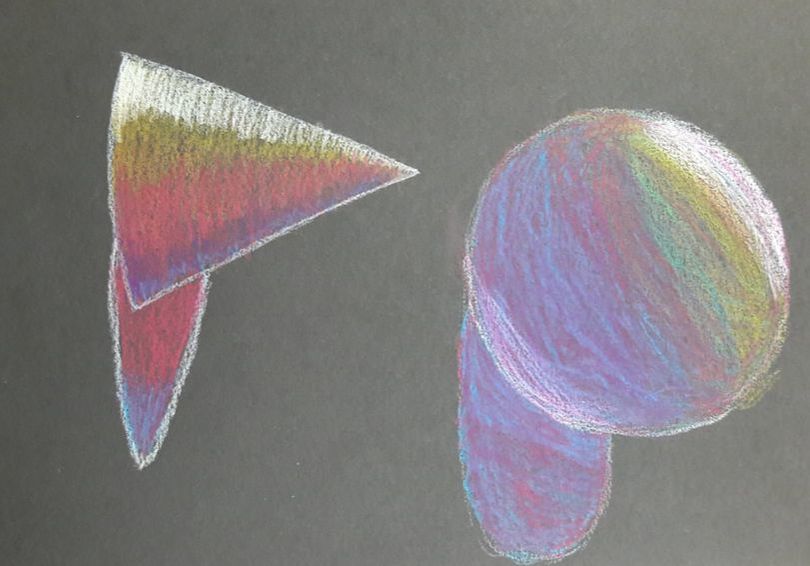 We had to shade in with our prisma colors the light and the dark with different colors on different shades of paper.
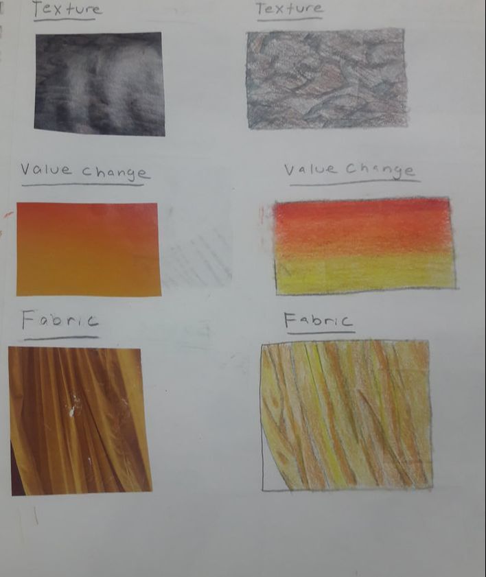
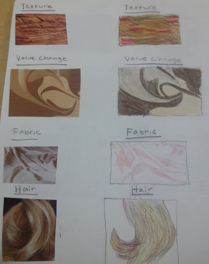 We had to cut out textures, hair, fabric, and value changes from a magazine and redraw them.
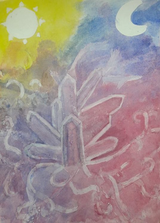 1. The procedure you had to do to create the poured watercolor painting was first you had to choose out what you were going to draw, next you had to draw it on a piece of paper and paint masking fluid on the places where you wanted it to be light. After that you sprayed a little bit of water on your piece and put paint all over it and slowly move your painting around to get a nice mix of colors. once you're finished you would peel away the masking fluid.
2. The difficulties i had with this project was most definitely trying to figure out what to draw. i originally was going to draw three cupcakes but i hated the idea so i changed the ideas to crystals. Another difficulty i had was trying to make the crystals actually have color in them. 3. 4 things i learned from this project was 1. I learned how to do this cool technique. 2. i know how to use masking fluid and what it does. 3. You shouldn't put too much water on your paper or else the paint won't look so vibrant, and 4. Be patient, the masking fluid takes time to dry and each section you have to put more paint on. 4. The thing i would do differently for this project was probably change the background or make the crystals even bigger. 5. I used layers to layer and make my crystals look like actual crystals, I didn't really use any textures, and lastly, i used blue and red to make this beautiful purple color. 6. I think that the mini watercolor lessons were beneficial because it shows how to shade and lighten or darken an object. 7. I believe having the guest artist come was exciting and a fun experience because we got advice from a professional artist who does watercolor for a living. 8. I learned that you always need to put paper towels under your piece when you do this project or else the paint will get under your art and ruin it. 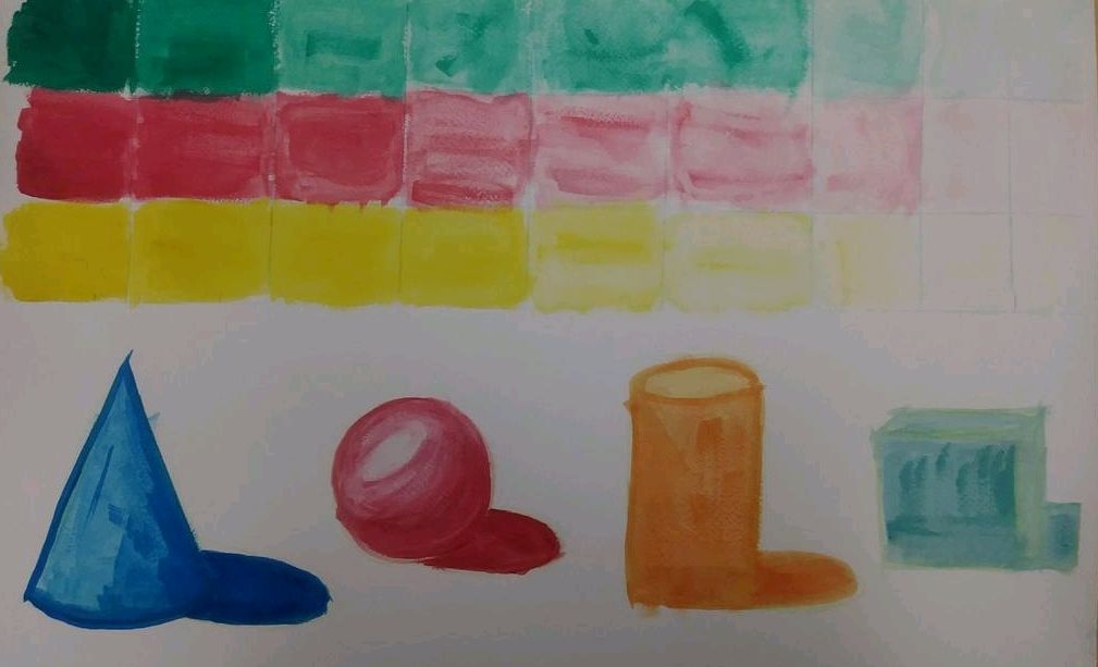 In this project we had to go from a dark shade to a light and at the bottom we had to draw 4 shapes and give them shadows and lights. 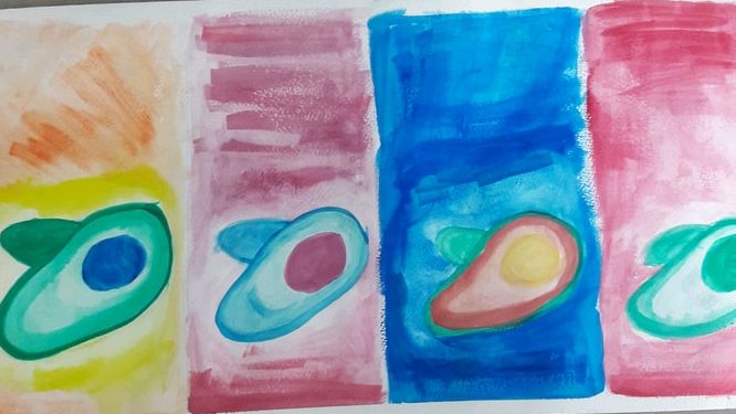 In this project we had to draw different cool and warm tone colors on a fruit or veggie. I picked an avocado. I struggled on this one because i didn't know which color to use and the shading was bad
|
AuthorWrite something about yourself. No need to be fancy, just an overview. Archives
May 2018
Categories |
 RSS Feed
